
This is the fourth and final post in this series of creating this quilt top. See below for links to the previous posts in the series.
My process is often upside down and backwards. Most people might plan out the composition before cutting a single fabric. In this case, although I started off having a general idea of where I was going, I did much of the composition as I went along. My first idea was a quilt with the words, “We’re all in this Together”. Then I wanted to add birds, but I also love the old fashioned folk art applique blocks that have vines and leaves. So, that was my starting point. I even did a little sketch! My quilt sketches all go in a notebook just for that purpose, but the sketches are really just super quick and small thumbnails. Here’s this one (actual size about 2 inches square):

I know, right? That’s not at all how it turned out! However, this is often all I need to get going. Things always change as I go along and that’s the fun of this process for me. It’s just never as fun if you know exactly what it’s going to look like.
So, let’s summarize the way it went. I first made a vine on a piece of background fabric. I thought this might work at first, but then decided I wanted it bigger to allow more room for the words, so I added the side piece. Then I figured out where to place the letters, keeping in mind that the letters should go closer together than you think before the edges are turned under.
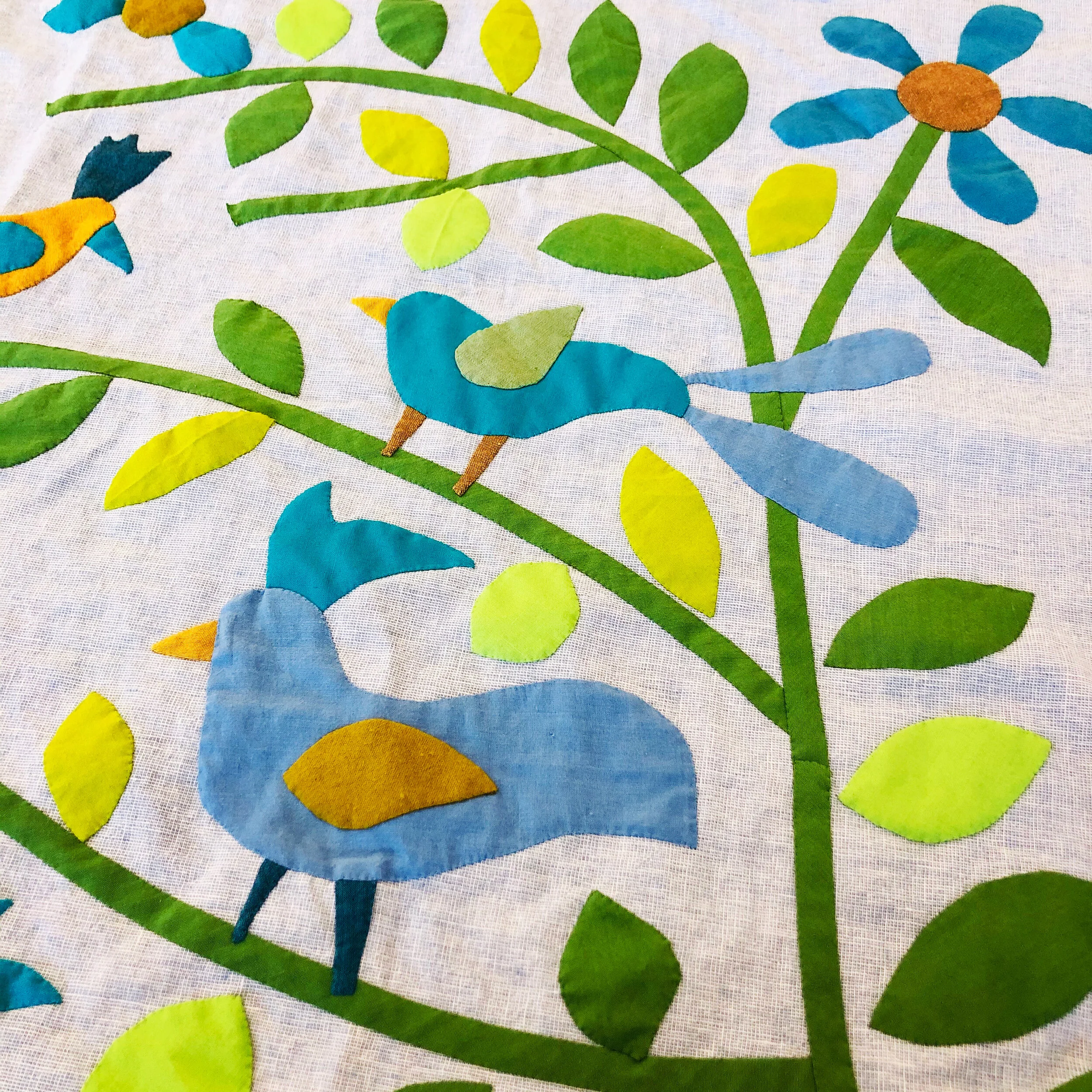
Every stage was stitched down before moving to the next: vines, words, birds and flowers, leaves, fruit.


Once the words and vines were in place, the next most important parts were the birds and flowers. The leaves are filler, so I wouldn’t want to do them first and not have enough room for my birds. I figured out the bird and flower placement and stitched them down. Then I cut a bunch of leaves, decided on placement, basted them and then stitched them down. The very last thing was the fruit. In this case, I also had to decide on color. I auditioned lots of colors and various fabrics from the scrap bin. I tried pink, purple, yellow, red, but in the end decided this orange looked best.

A note about the initials and date on the front of this quilt. They are right there for everyone to see because I knew that the year would be very significant and I wanted it to be prominent. However, I also wanted it to blend in a bit, so I made it in a subtle green that doesn’t stand out too much and makes it sort of blend with the leaves. I will, of course, also label this quilt on the back.

I’m really happy with how this came out. I plan to hand quilt it, but I have several projects waiting for hand quilting and I think I’ll take it a bit slower with this one. I’ll do an update when it’s finished though.
I think it would be wonderful to have others inspired by this series, but that doesn’t mean I give permission to copy my quilt. If you do make a piece in this style I hope you’ll make it your own. Use your own hand writing to design your letters and place them in a way that makes sense for your composition. Maybe you’ll use birds, but maybe you’ll use another animal that has meaning for you, or just have flowers and leaves, or fruits and leaves. You could even do something more formal with a vase of flowers or a tree instead of the vine. There are infinite possibilities, but I hope I’ve sparked your imagination!
See the following posts for the rest of this series:
